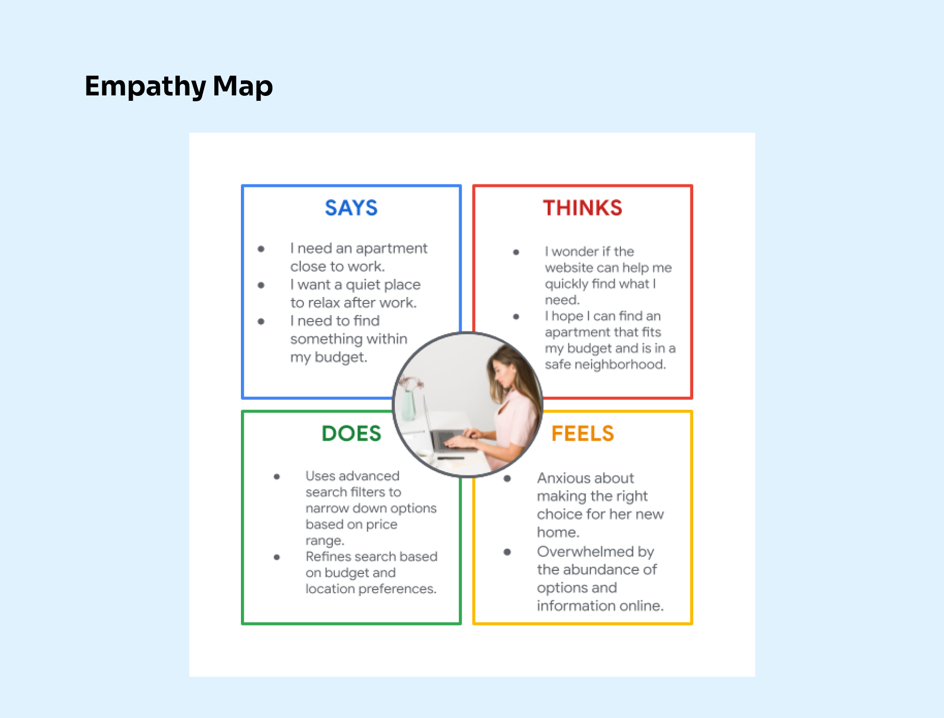
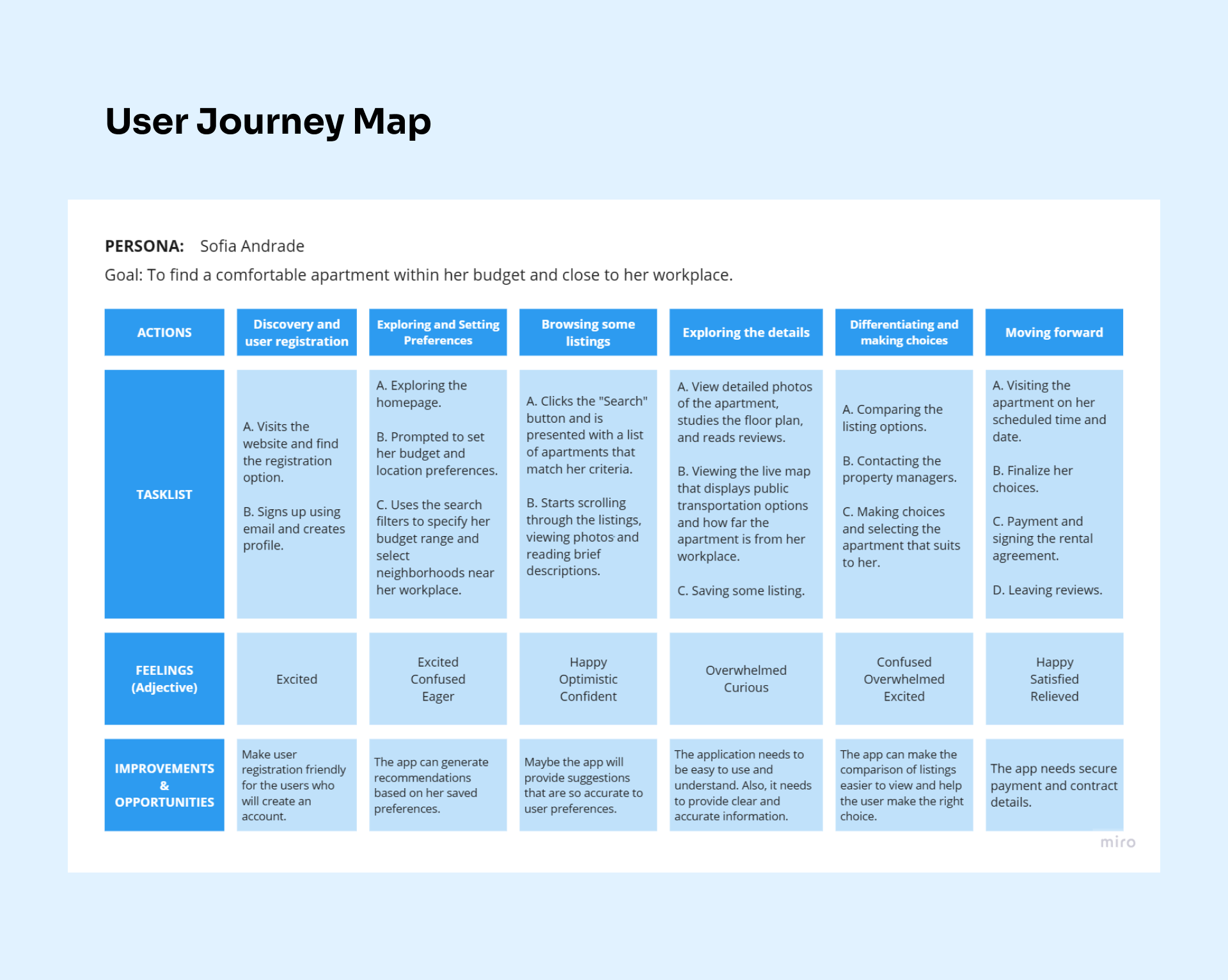
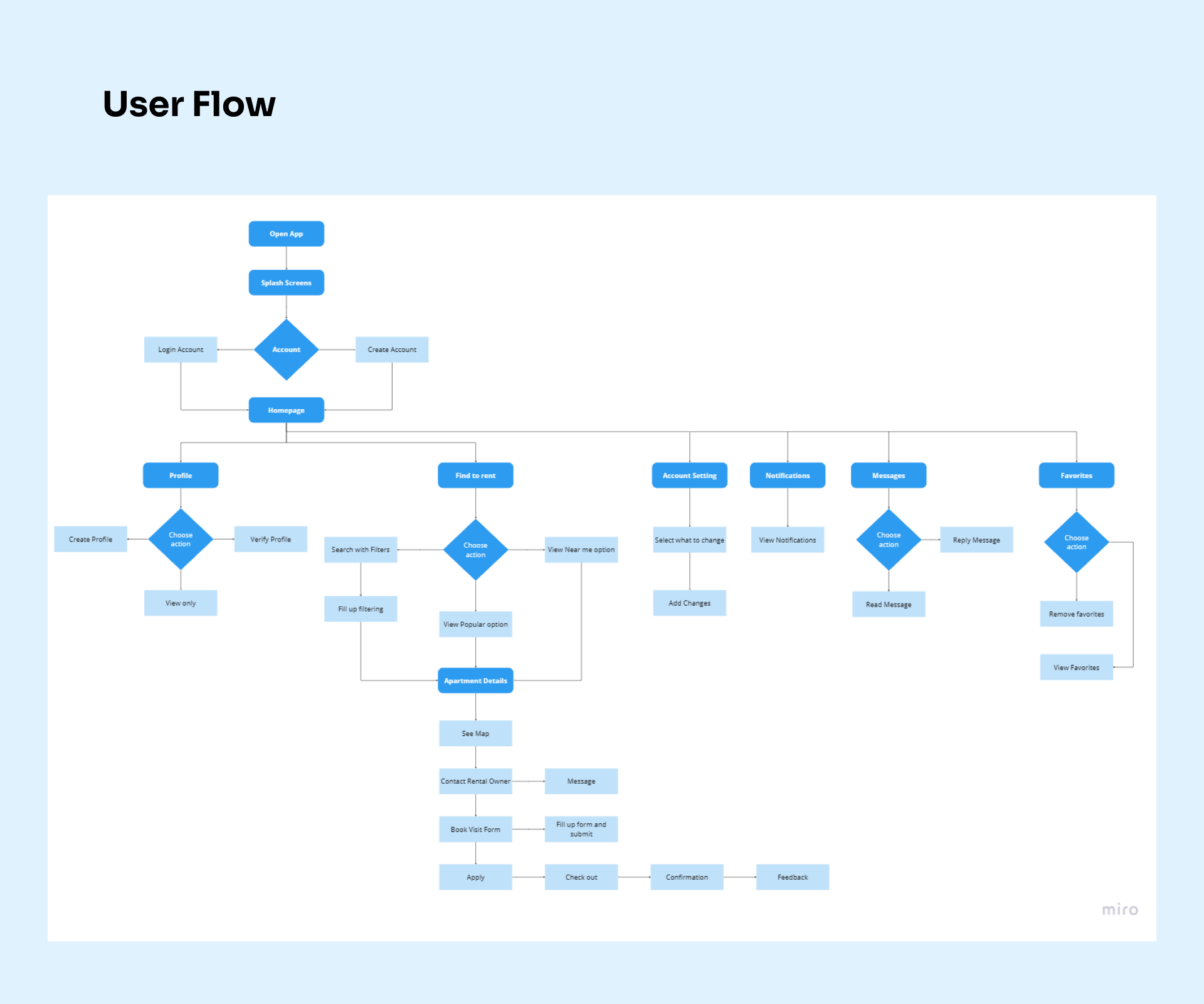
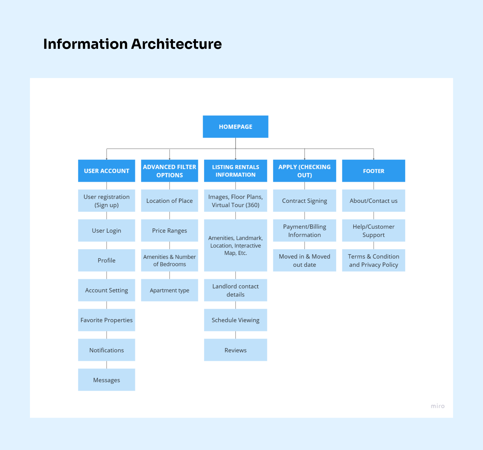
Rentopia

UX Design Case Study

July 2023 to August 2023
Design a website for finding apartments.
Project Overview
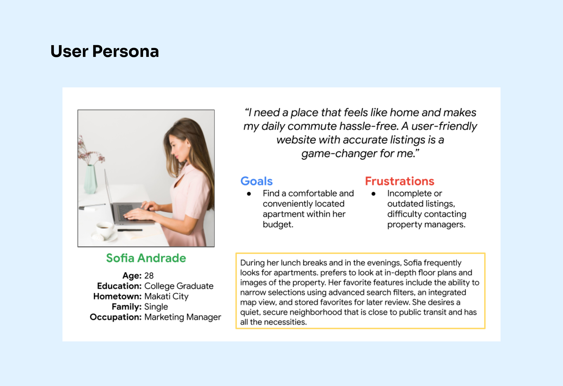
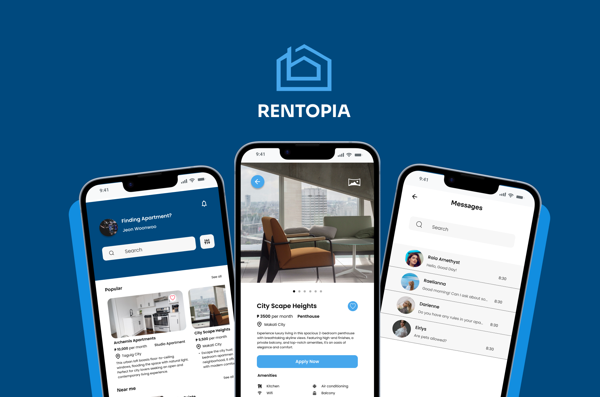
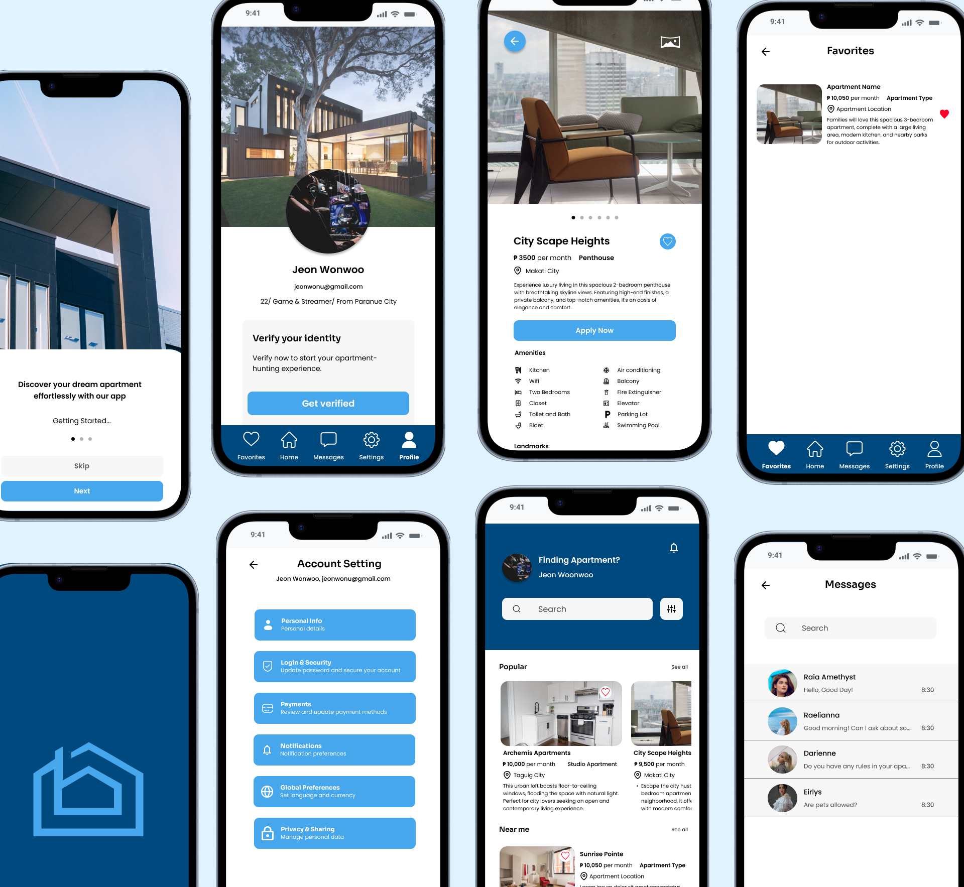
Rentopia is a website and mobile application where users can find an apartment that meets their requirements and needs hassle-free. Users can view and explore different apartments, use advanced search filters, easily communicate with landlords or agents, and apply to their choice of apartment effortlessly.
My Roles & Responsibilities
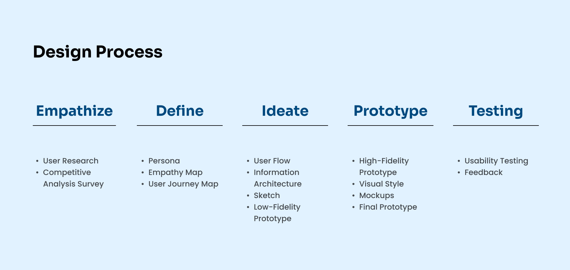
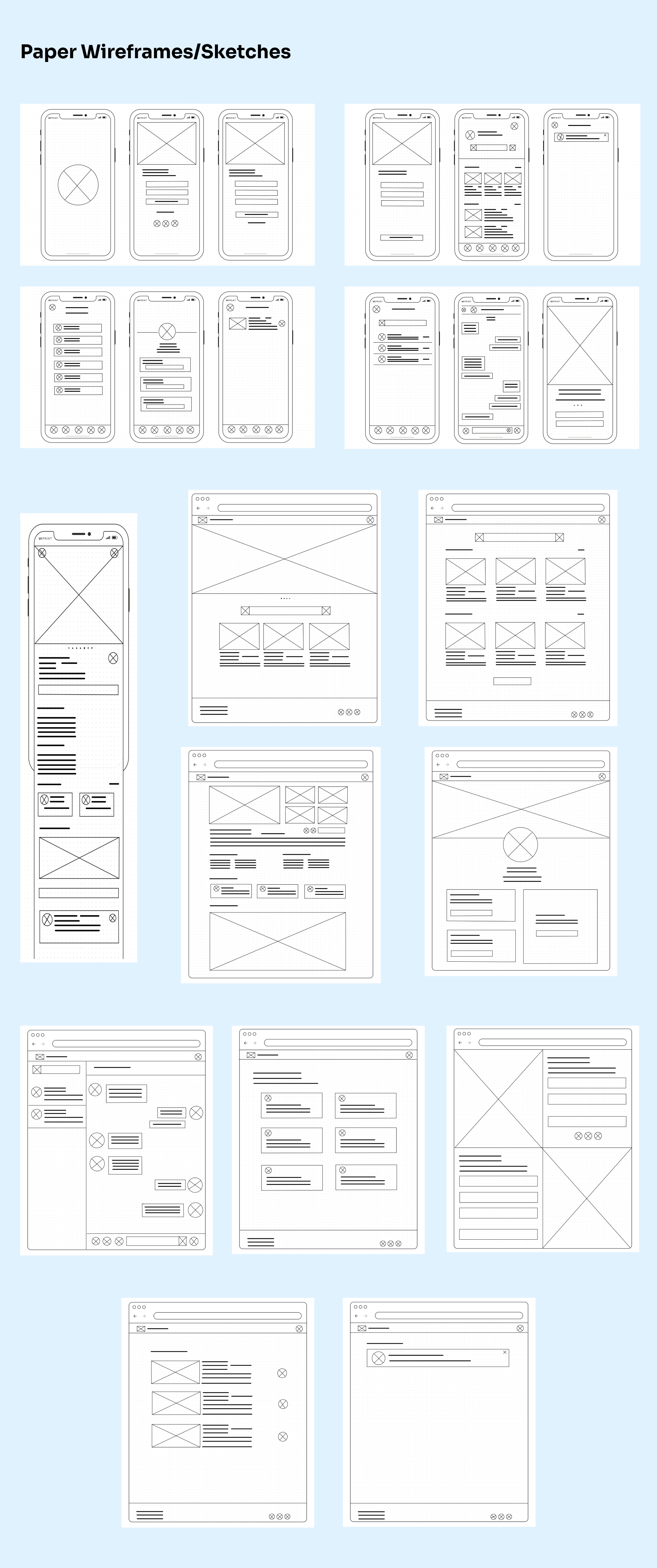
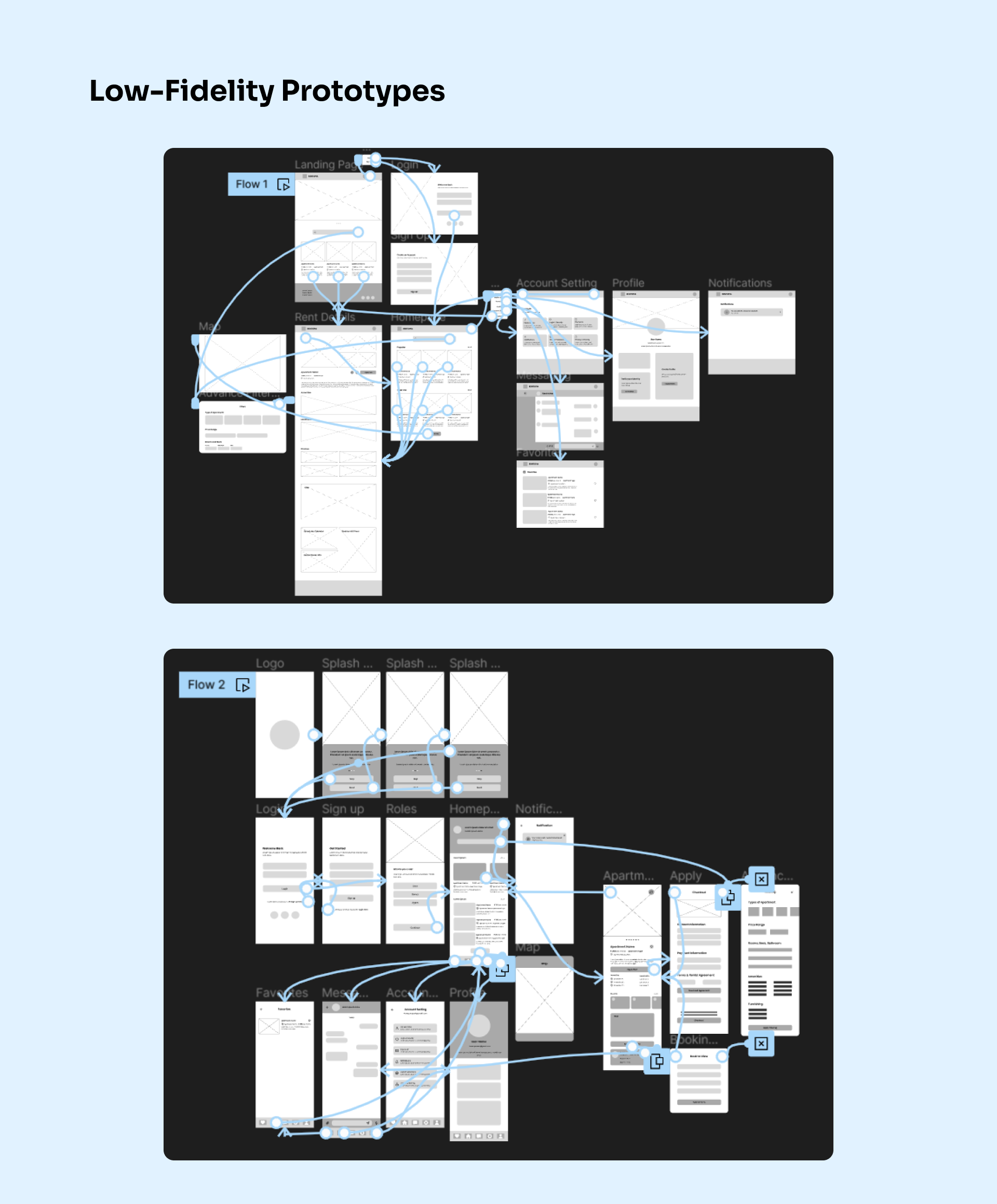
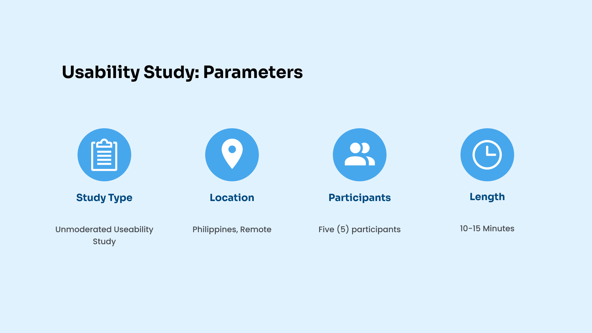
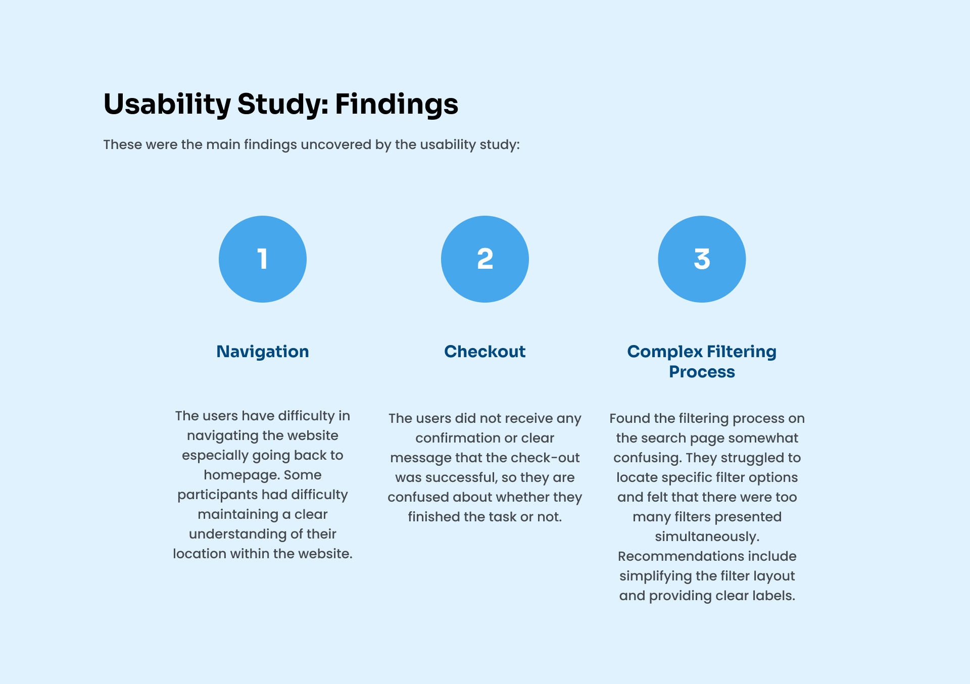
My role in this project are UX Designer, UX Researcher, UX Writer. My Reponsibilities are the following: Conducting Interviews, User Research, Sketching, Wireframing, Low-Fidelity Prototyping, High-Fidelity Prototyping, Mockups, Conducting Usability Studies.

About the Project

The Problem & Solutions
Trying to minimize the overwhelming search results since many apartment search websites tend to provide users with a wide range of search results. Secondly, there is a lack of trust in listings since users often face concerns about the accuracy and legitimacy of apartment listings on online platforms.

The solutions that have been implemented in this study first used advanced search filters so that the results were more specific and related to what the users wanted to see in the results. In addition, providing more information about the landlords and apartments and communicating with them will help ease the doubts of the users. Nowadays, there are a lot of frauds online.
The Goal
The objective of this project is to create a user-centric apartment-finding application that simplifies the apartment search and rental process while increasing customer satisfaction, trust, and transparency.

The Design Process

The objective of this project is to create a user-centric apartment-finding application that simplifies the apartment search and rental process while increasing customer satisfaction, trust, and transparency.
design process of rentopia
User Research Summary
Our comprehensive detailed user research was conducted for this apartment-finding project. In the initial stages, we conducted surveys and online forums to learn more about the concerns and preferences of apartment seekers. Additionally, we developed assumptions about the main user groups and their requirements, such as effective search and belief in listings. However, when we explored deeper into user interviews and usability testing, our presumptions substantially changed. We also learned that tenants valued having direct contact with landlords. The project's overall direction was shaped by our user research, which ultimately resulted in a user-centric design that takes into account the real needs and preferences of apartment hunters.

Research Questions:
1. What channels or platforms do you typically use when looking for a new place to live?
2. What are the factors you consider when looking for an apartment?
3. Do you need specific amenities or features, if you have what are those?
4. What features do you expect from a website that helps you find apartments?
5. Can you tell me about a time when you faced a significant challenge while searching for an apartment online?

Competitive Analysis
Understanding the Landscape
We conduct thorough competitive research to show how our apartment search website compares to the key competitors in the industry. We gain insightful information by analyzing their user experiences, features, and design choices to guide our design choices and make sure that our platform not only meets but surpasses user expectations.
competitive analysis of rentopia
User Pain Points
Uncovering Opportunities for Enhancement
We analyze the difficulties and inconveniences visitors had when using our apartment-hunting website. We identify pain areas that prevent a seamless experience by carefully studying user comments and observations. This thorough evaluation acts as a guide for specific enhancements, ensuring that our platform is adapted to user requirements and expectations.
user pain points
Persona
Problem statement:
Sofia Andrade is a busy 28-year-old marketing manager in Makati City who needs to find a comfortable apartment within her budget and close to her workplace so that she can go there easily and save money.
user persona
Empathy Map
Illuminating User Perspectives
In order to fully understand our customer satisfaction perspectives, we construct an empathy map. We obtain a deeper insight into users' thoughts, feelings, motivations, and pain spots by combining user interviews, observations, and feedback. This technology enables us to design with empathy, ensuring that the needs and feelings of our consumers are accurately reflected on our apartment-finding website.
empathy map
User Journey Map
Charting the Path to Enhanced Experiences
This represents the user journey map of Sofia Andrade and how she maneuvered within the application. This also includes the actions, tasks, and feelings that Sofia felt and things to improve. Using her experience helped to lead what are the possible user pain points.
user journey mapping
User Flow
Orchestrating a Seamless Path to Success
We analyze the user flow of our apartment-hunting website, looking at how users move across it to accomplish their objectives. We lay the basis for a more logical and effective user experience by detecting bottlenecks, inefficiencies, and places of misunderstanding. This analysis guides our design choices, ensuring that customers can navigate the website with ease in search of their suitable property.
user flow
Information Architecture
Structuring Clarity and Accessibility
We learn the information architecture that supports the organization and accessibility of the core of our apartment search website. We want to establish a user-centric structure that enables users to quickly discover the information they need through careful categorization, labeling, and navigation design. This careful procedure guarantees that our platform will always be simple to use and enhances the user experience.
sitemap
Sketches
Translating Ideas into Visual Concepts
Using the GoodNotes application, I sketched the paper wireframes that will be used in making the digital wireframe and low-fidelity prototype.
sketches
Low-Fidelity Prototype
Bringing Concepts to Life with Simplicity
From paper wireframes, we will proceed to make digital wireframes. Using digital wireframes, we will make the designs understandable and help address user pain points to improve user experiences. After the digital wireframe, I created a low-fidelity prototype and connected all of the screens involved in the user flow.
Low-Fidelity Prototype Link
low-fidelity prototype
High-Fidelity Prototype
Elevating Design Precision and Realism
My high-fidelity prototype followed the same user flow as the low-fidelity prototype. However, the high-fidelity prototype includes some design changes made after the usability study.
High-Fidelity Prototype Link
high-fidelity
Usability Testing
Putting the User Experience to the Test
We start with the usability testing procedure, a critical stage in confirming the design of our apartment-finding website. By including actual users in interactive scenarios, we can evaluate how well our interface satisfies their demands, spot possible problems, and see where they can be improved. We learn priceless lessons that help us create a smoother and user-centric experience through user feedback and observations.
usability study findings
usability
Visual Style
Crafting a Distinctive and User-Centric Aesthetic
I opted to use blue because it evokes feelings of loyalty, trust, security, and dependable authority—all of which I wanted my target users to experience while using the app. When choosing the ideal place to live, I want users to feel comfortable, dependable, and safe.
visualcomponents
Accessibility Considerations
1. Utilized headings and two font and size combinations to highlight hierarchy and readability.
2. Used text alternatives to give users who use screen readers a way to understand the meaning of photos, icons, and other non-text information by providing illustrative alt text.
3. Maintain a consistent navigation structure across all of your pages to make it simple for users to understand and navigate the website.
Major Design Iterations
Evolving Toward Optimal User Experiences
We review the crucial turning points in our design journey when we improve and refine something. We outline the key iterations that helped to develop our apartment search website, demonstrating how user input, usability testing, and iterative design cycles drove important improvements. By ensuring that our platform smoothly satisfies customer needs and expectations, each iteration brings us one step closer to delivering the best possible user experience.
mockups 1
mockups 2

Reflection

What's next steps?
By simplifying the search process, enhancing transparency and trust, and providing personalized recommendations, the designs of this project have significantly improved the apartment-finding experience, enabling users to make informed decisions and saving them valuable time and effort in their apartment search.

1. Conduct another usability study: To make sure that the user experience and design will improve the website need to collect feedback, suggestions, and testing.
2. Adding additional features like: Safety Information that provide details on area safety, including crime statistics, a community's accessibility to schools, and available public transportation and comparing listing that allows customers to compare side-by-side numerous apartment listings from their search results, making it easier for them to evaluate and rank their alternatives.

Conclusion

What I have learned?
In creating this apartment-finding app, I've discovered that in order to create a positive user experience, we need to empathize more with the users in order to be aware of the things they need in order to make the best decisions that are well-suited to their preferences and needs in an apartment. Since I also rent an apartment, I try to put myself in the target users' perspective. I consider what requirements I would need in a new house if I were to move there in order to feel safe and comfortable.
cover