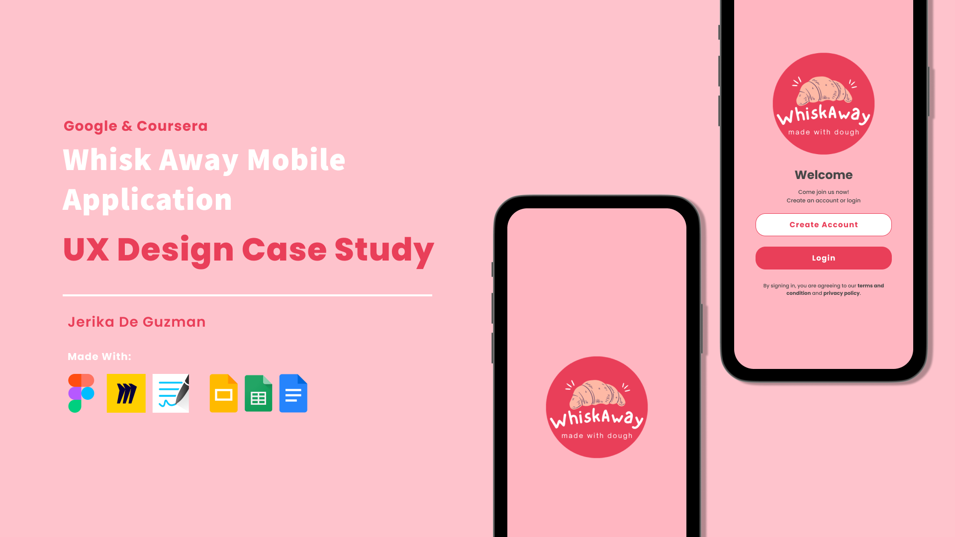
Whisk Away App

UX Design Case Study

May 2023 to July 2023
Design a menu & ordering app for a bakery.
Project Overview
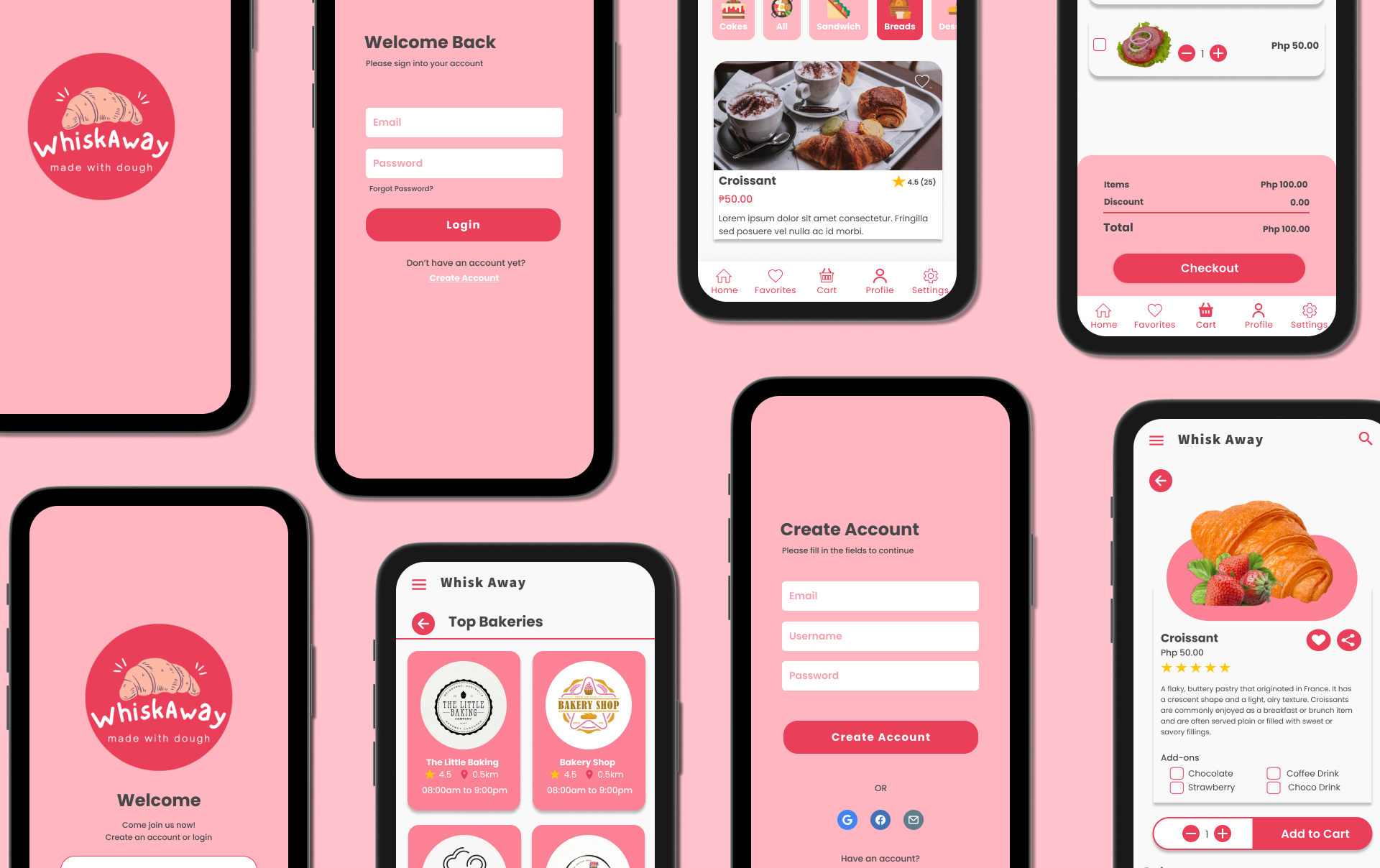
The Whisk Away Application is a bakery shopping app for the customers of the bakeries. Through this application, the customers can view the menu of their favorite bakery, add items to their cart, add products to their favorites, checkout, and track their orders. It will make the ordering process smooth and hassle-free without having to go to the actual bakery and wait in line.
My Role & Responsibilities
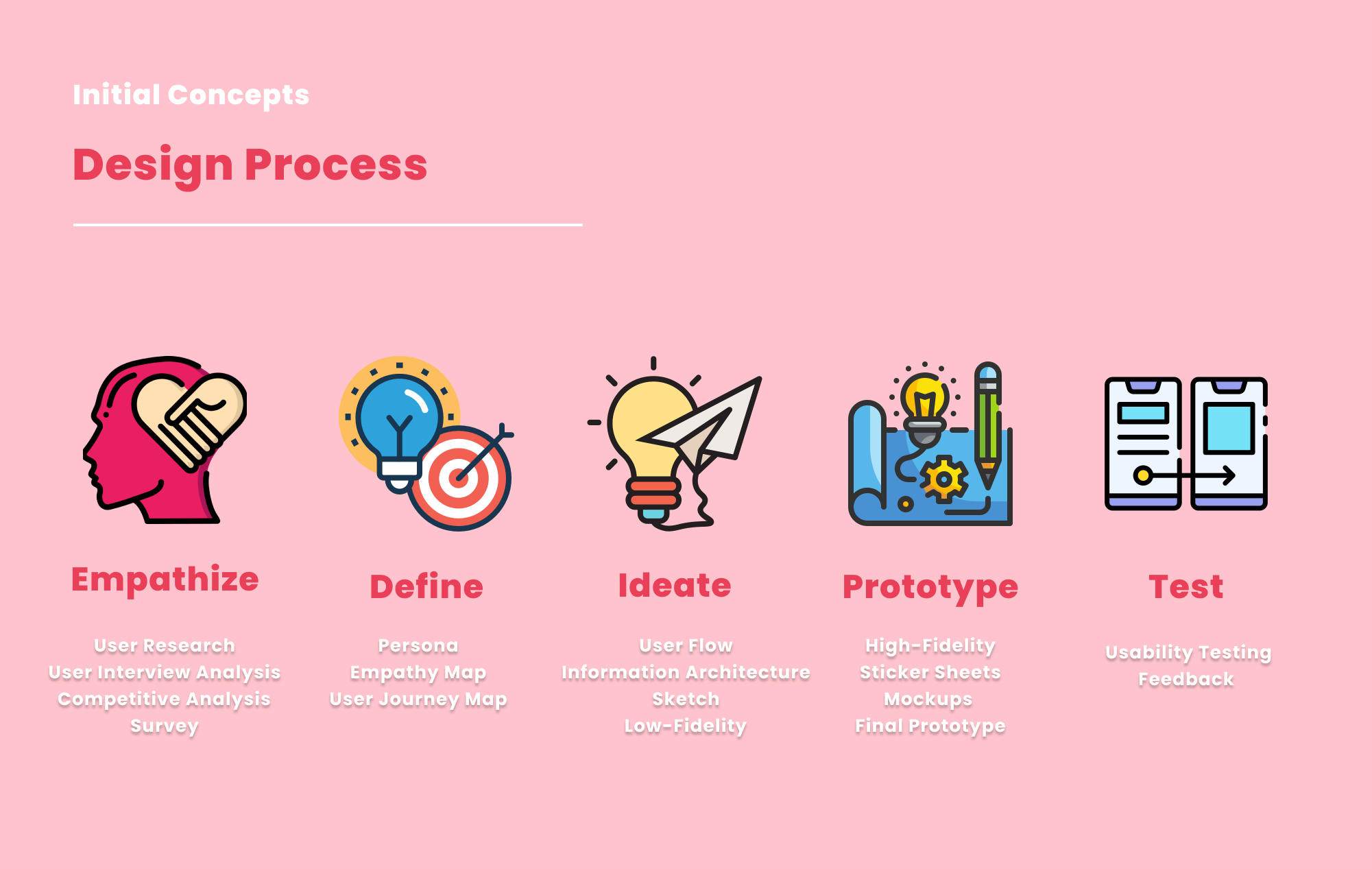
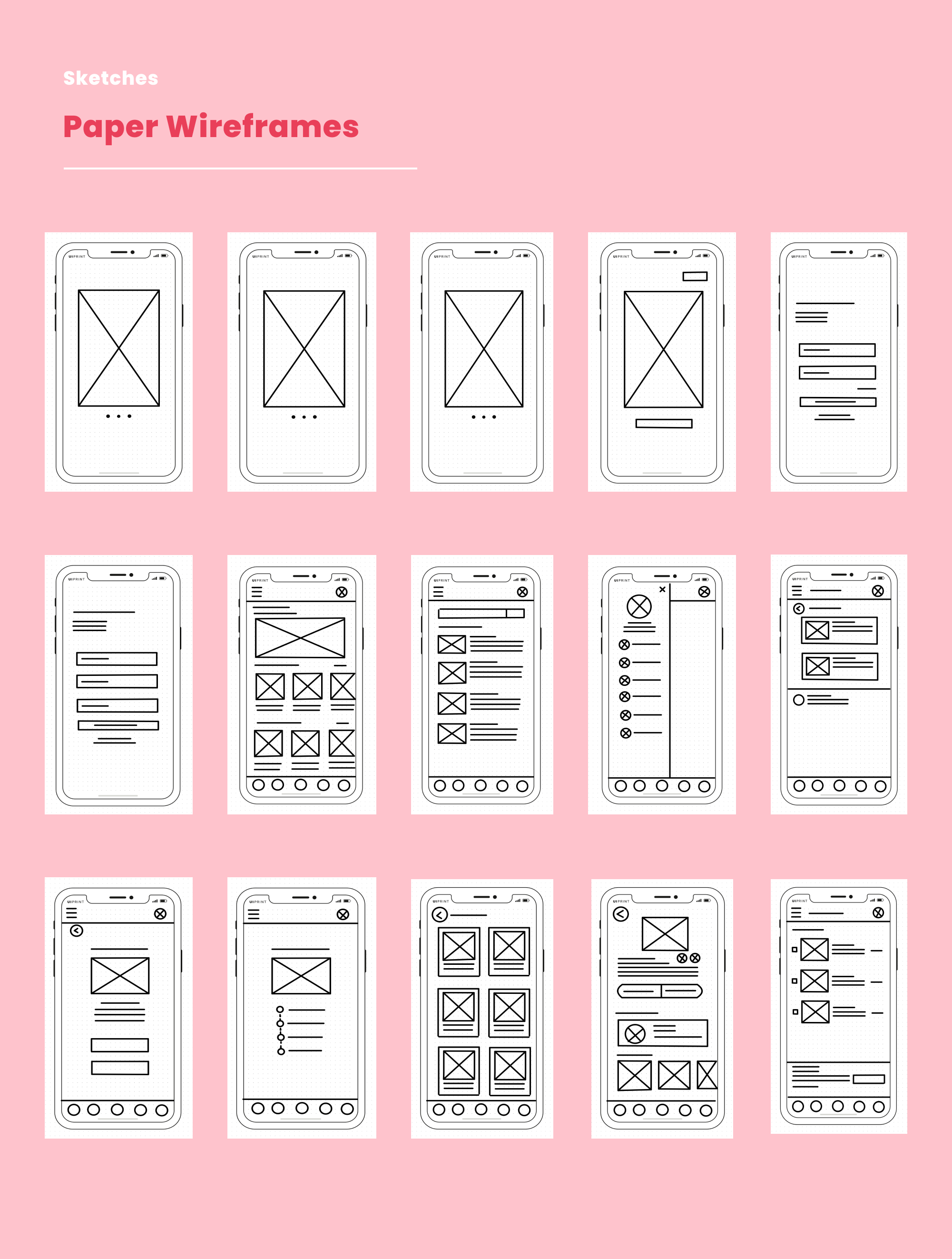
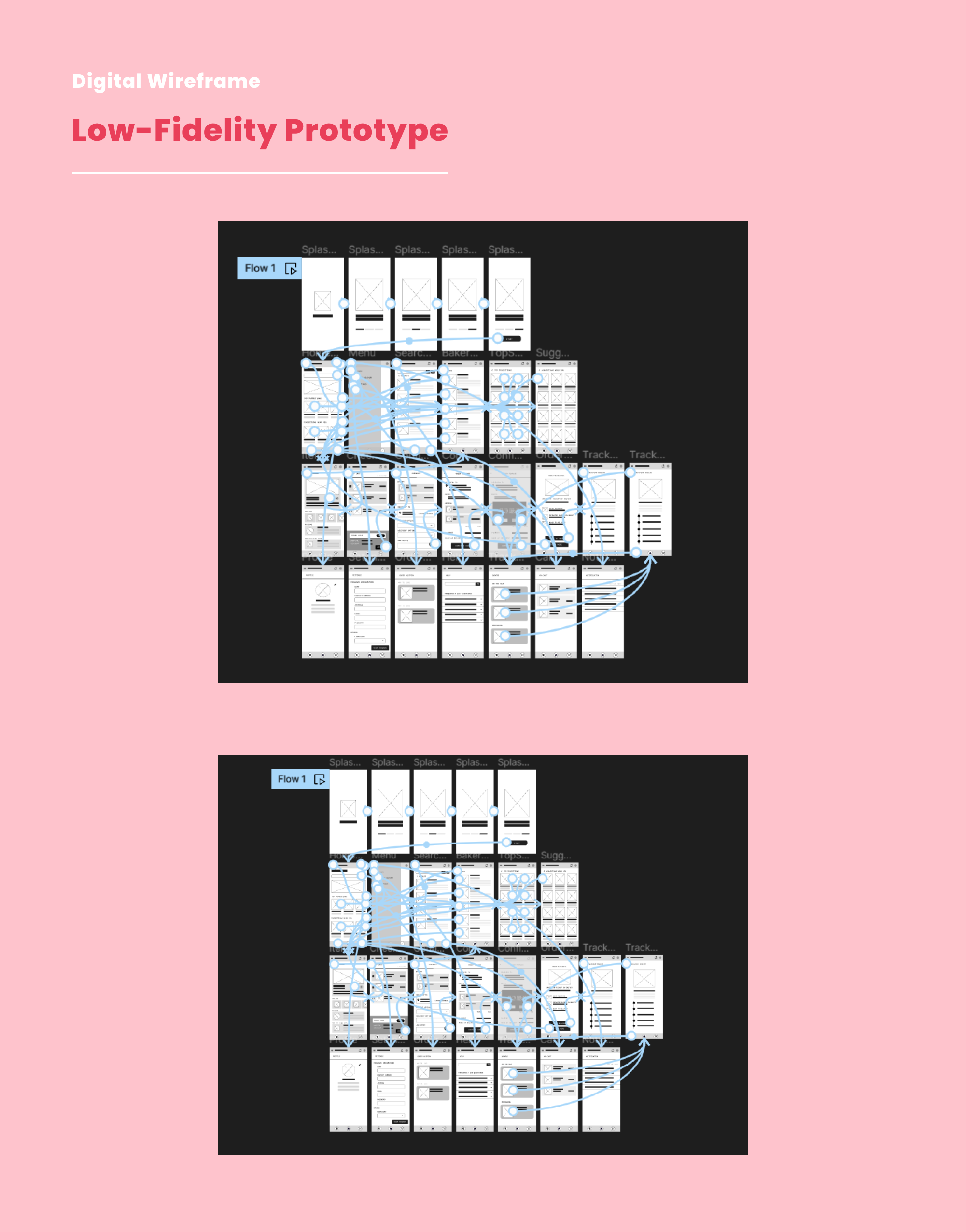
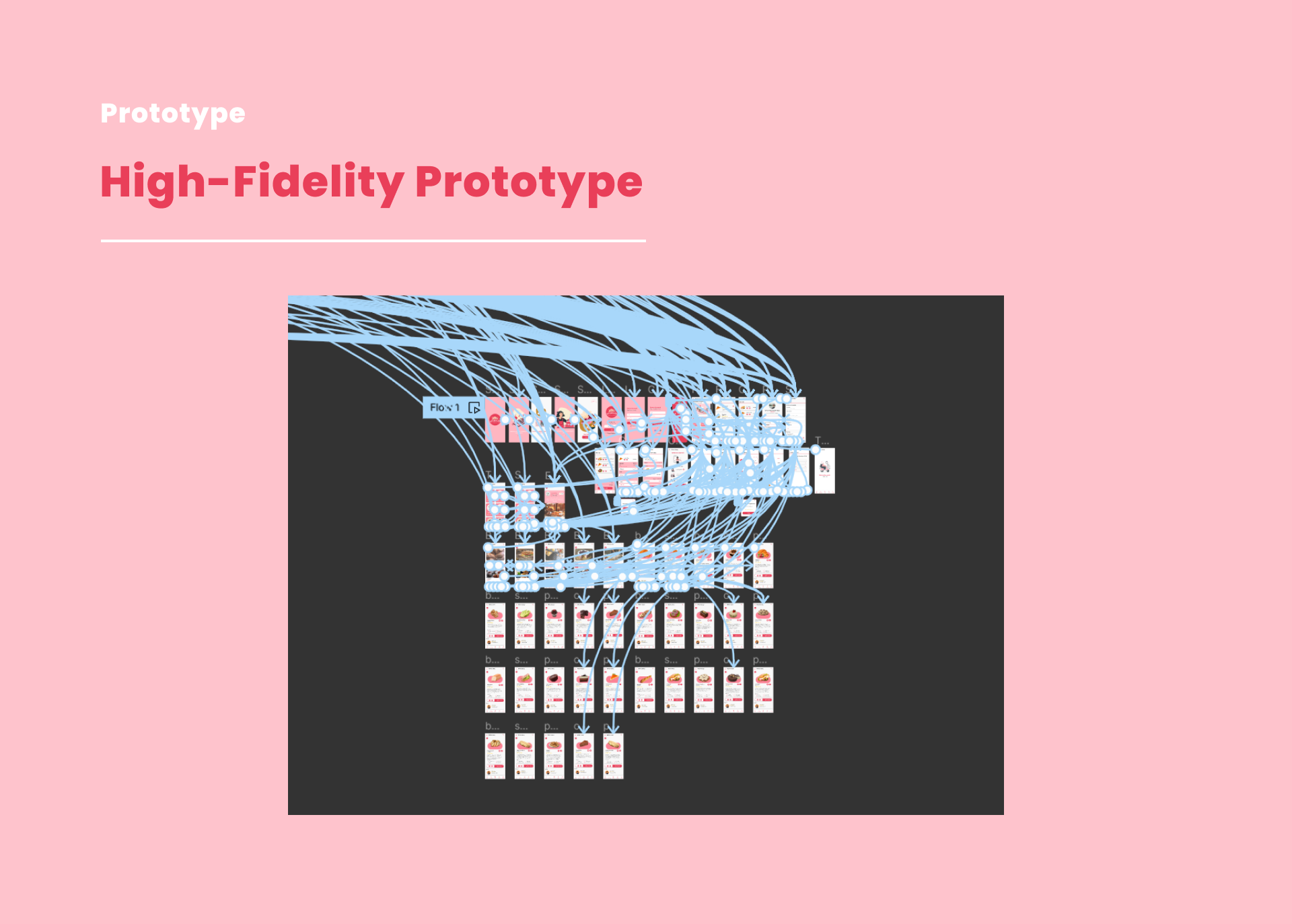
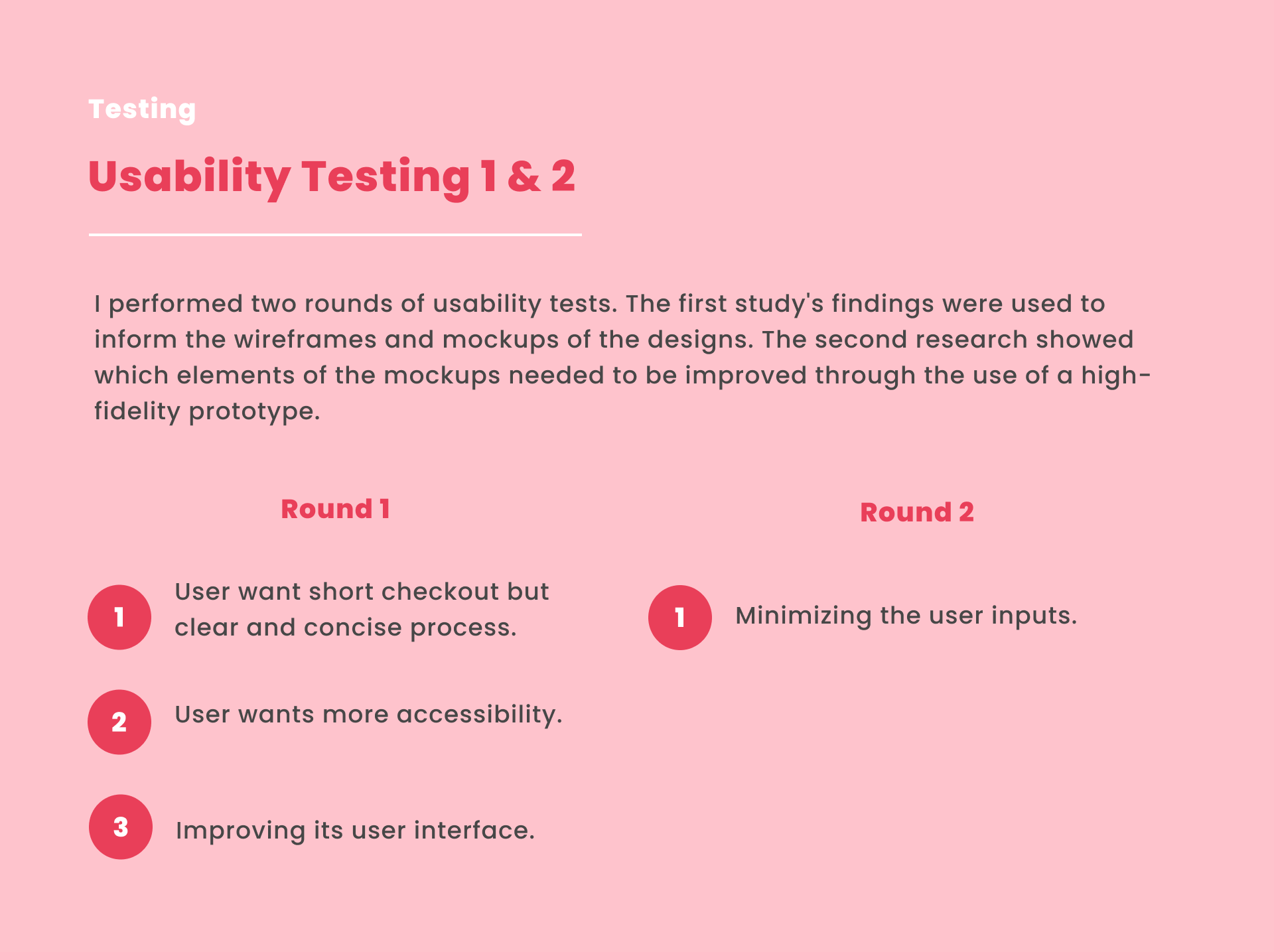
My role in this project are UX Designer, UX Researcher, UX Writer. My Reponsibilities are the following: Conducting Interviews, User Research, Sketching, Wireframing, Low-Fidelity Prototyping, High-Fidelity Prototyping, Mockups, Conducting Usability Studies.

About the Project

The Problems & Solutions
Trying to make it convenient and have a user-friendly interface so that users can view the bakery's menu and place orders, whether they are doing so in person or online.

Improved Customer Experience: Develop a platform that is easy to use and gives customers a great experience when they browse the menu and place orders at the bakery.
The Goal
Establish the app's effectiveness in time-saving for users and evaluate its user-friendliness and ease of use.

The Design Process

After understanding the user’s needs and expectations, I designed an application based on problem-solving and interviews. Thus, I created sketches, wireframes, and low-fidelity prototypes. Also, I conducted user testing with five (5) participants and incorporated the feedback to refine the design. Subsequently, I created a high-fidelity prototype.

Initial concepts: design process
User Research Summary
I conducted interviews and developed empathy maps to gain insights into users' challenges and requirements for a bakery app. What I discovered is that one of the primary user groups identified through research consists of bakery/baked goods enthusiasts – individuals who have a passion for baked goods but lack the time and energy for in-person visits, as well as those who lack baking expertise.These users affirmed the assumptions surrounding the need for a bakery application. However, the research also unveiled that factors beyond energy, time, and knowledge contribute to the hindrance of baking at home. Several users expressed challenges stemming from their household obligations, personal hobbies that baking doesn't align with, and the difficulties they encounter when acquiring baking ingredients and equipment or visiting a bakery.

Research Questions:
1. How long does the user can make an order?
2. What we can learn from the steps the user took to order?
3. Are there any parts of the ordering process where users are getting stuck?
4. Do you think all of the features of this ordering app are helpful?
5. Are there any designs that need to change in order to improve the user experience?
Competitive Analysis
This illustration demonstrates the existing product about its strengths and weaknesses. The illustration below is the summary of the competitive analysis survey.

To view the full details click this: Competitive Analysis
Competive Analysis
User Pain Points
In this user research, the user pain points are the following. The user pain point is being used to understand and empathize with the users to provide solutions to their problems.
user pain points
User Persona
I conducted supervised user research and received feedback from users that we incorporated into user personas. For example, our persona Sebastian is frustrated about the queue and long lines in bakeries that he likes. Sebastian tried to find a delivery application online, but he has not discovered something that is convenient and made for only bakeries application.
persona
Empathy Map
I created an empathy map to understand and empathize with the potential users regarding their perspective and to inform the creation of products, services, and solutions that truly address their needs and preferences using this map. This empathy map will be used as a visual representation that will help me gain insight into the thoughts, feelings, behavior, and needs of the people.
empathy map
User Journey Map
I also created a user journey map to visualize the actions, interactions, and emotions a user goes through when interacting with an application. It helps me to understand the user’s experience, identify pain points when using the app, and discover what I need to improve.
user journey map
User Flow
I created user flow as a visual representation of the path a user takes through a product or website to accomplish a specific task or goal. It outlines the sequences of steps, actions, and decisions that the user makes as they navigate through the interface of the application. I used Miro to make this illustration.
user flow
Information Architecture
I created an information architecture to label contents within the application. Also, it involves creating a logical and user-friendly arrangement of information to help the user navigate and find what they are looking for easily. In order to create this structure, I used Miro again.
the information architecture
Sketches
I made hand-drawn sketches/paper wireframes to make an outline of the layout and basic elements of a user interface within the brainstorming and early stages of ideation. I created paper wireframes using an iPad and the GoodNotes application.
sketches
Low-Fidelity Prototype
This is my idea for an interactive digital low-fidelity prototype and the version that I revised after I gathered feedback from five potential users.

Low-Fidelity Prototype Link
lowfidelity prototyping
High-Fidelity Prototype
This is an interactive high-fidelity prototype that I developed based on an enhanced low-fidelity prototype.
High-Fidelity Prototype Link
high-fidelity prototyping
Usability Testing
I performed two rounds of usability tests. The first study's findings were used to inform the wireframes and mockups of the designs. The second research showed which elements of the mockups needed to be improved through the use of a high-fidelity prototype.
usability testing
Style Guide
Typography & Color Palettes of Whisk Away Application.
style guide
Accessibility Considerations
1. Used icons, label, side menu and bottom menu to help the users navigation easier.
2. Used accurate hd images for products so the users can identify it.
3. Provided a dropdown button before signing in/ login account to make the user choose the language they prefer.
Major Design Iterations
I made major modifications based on the feedback that I received from the usability testing sessions. I took note of the user comments and suggestions and worked hard to implement them in a way that would provide the best user experience possible. My goal was to create a product that was easy to understand, efficient to use, and enjoyable to interact with. To achieve this, I paid close attention to the user feedback and made changes accordingly.
a design iteration 1
a design iteration 2

Reflection

What's next steps?
1. Adding an additional feature where the user can message the delivery man and the bakery branch that they want to place an order.
2. Enhancing the Whisk Away application interface and updating it.
3. Considering the integration of a loyalty program where users can earn points and rewards for frequent orders.
4. Ensuring that the app is optimized for a wide range of devices and screen sizes, including tablets and desktops.
5. Conduct an accessibility audit and make any necessary adjustments to ensure the app is usable by individuals with disabilities.

Conclusion

What I have learned?
Designed a visually appealing interface application for a bakery app, prioritizing intuitive navigation and simplifying the order process. They learned to prioritize user needs and preferences through user research and feedback, recognizing that UI/UX design is more than just visuals. User testing and continuous improvement are essential for a refined and user-friendly application. The project highlights the importance of empathy, adaptability, and collaboration in creating impactful digital solutions, driving business growth and fostering a commitment to ongoing improvement.
detail cover
mockups